Explained in 10 seconds
The average time spent on precision cooking feature from finding the food item to start cooking was 13+ minutes, indicating it was confusing and hard to use.
Time spent navigating this feature decreased by 70%, and 100% of the users with varied cooking experience successfully completed all the cooking tasks assigned.
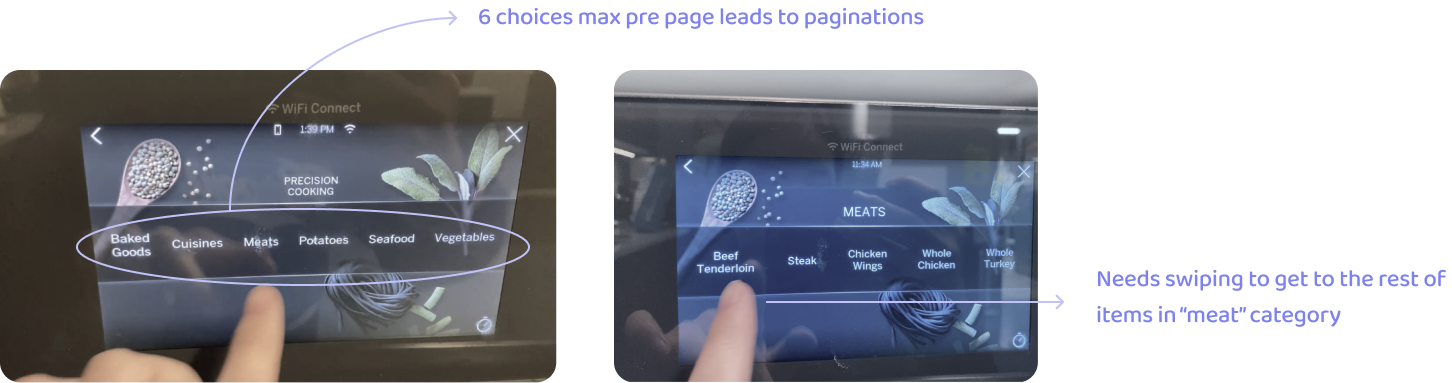
Without android technology, our LCD system currently does not support a search function. The users have to go through a deep menu and swipe several times to find the right food among 120+ options.

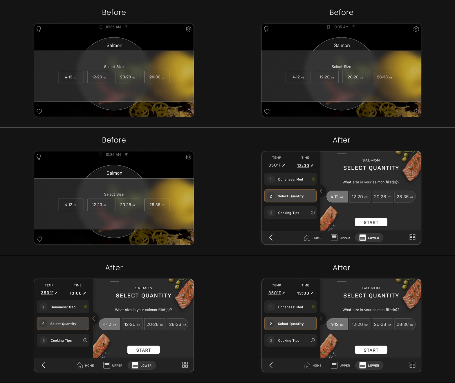
When they select the food parameters (size, quantity, thickness), the linear pathway only allows them to move forward without any backward option. If they misstep, they have to start over. For complex items, more than 10 taps are required before start.
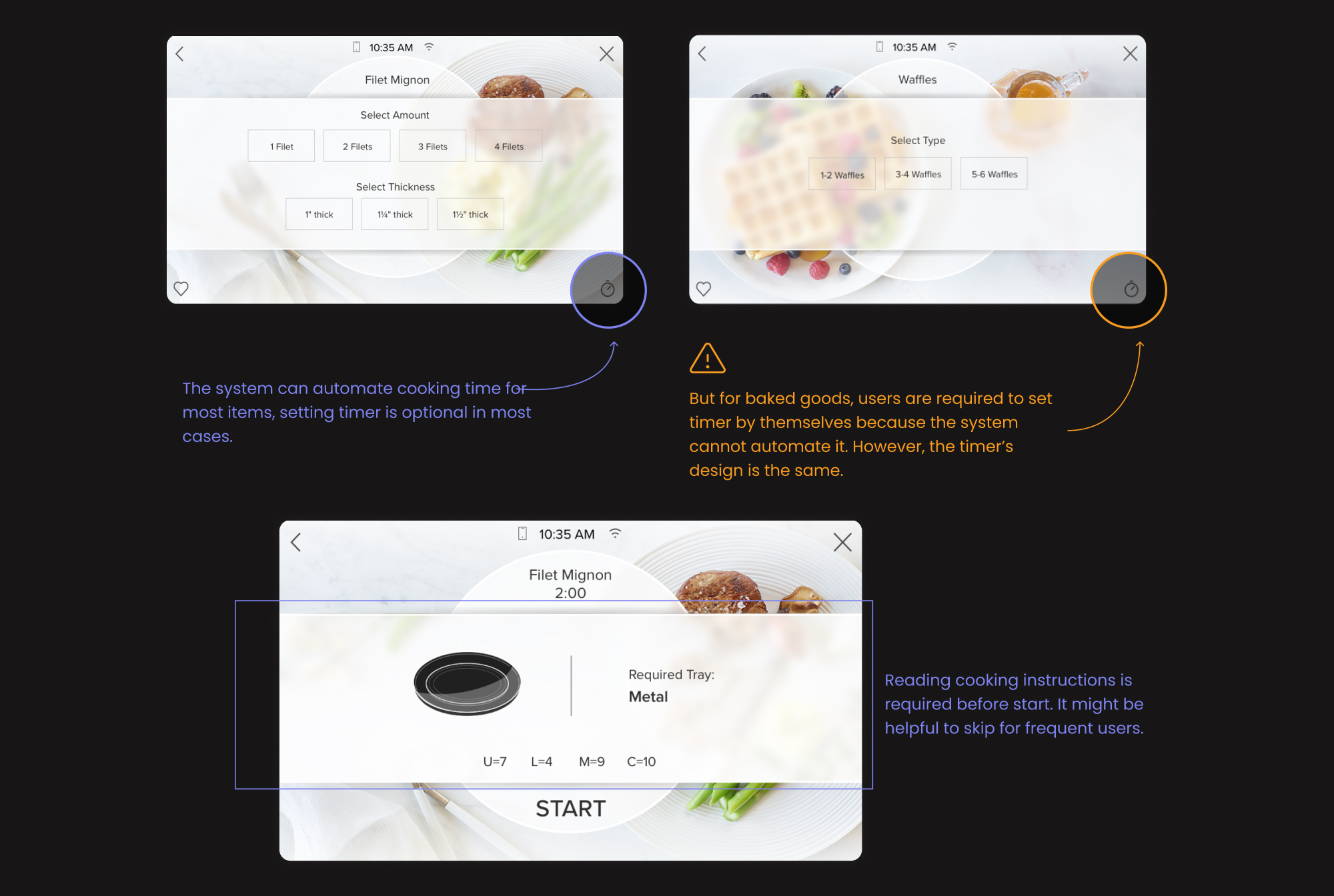
Food items has different properties. For example, setting a timer is required for baked goods, but is optional for meats and veggies. However, the “timer” is placed at the same visual hierarchy, which confused the users.
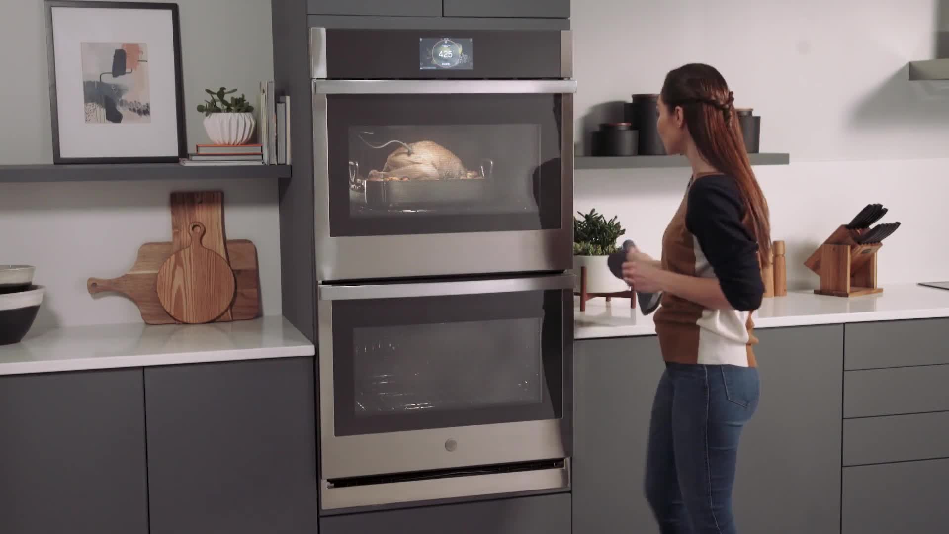
“Precision cooking” feature existed on “GE profile” smart ovens, which is a high-end brand that targets feature seekers, who are the “pioneer of Firsts”.

The brand team interviewed 50 feature seekers, and here’s their thoughts about precision cooking.

“I wish the it could just automate everything for me. I just need to input how I want the food to be done.”

“It would be nice if I could use the suggested time and temp as reference, and still be able to change them.”
Some of them have progress indicators during food parameter selection, which is good to let the users keep track of the steps.
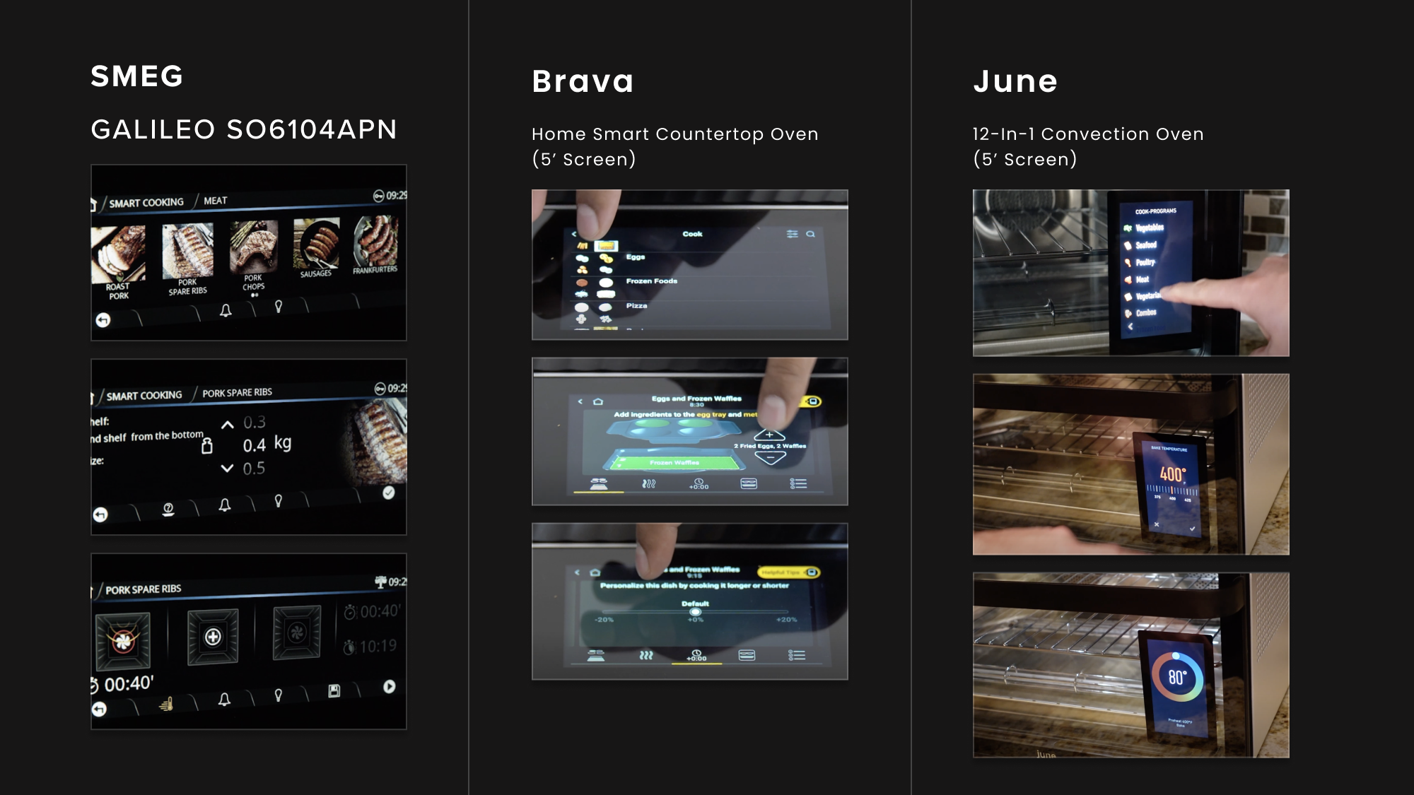
They have some similar problems with small LCD screen: too much scrolling / paginations for large number of food items.
Brava has images & animations on the food selection pages and cooking instructions, which is helpful for first timer users.
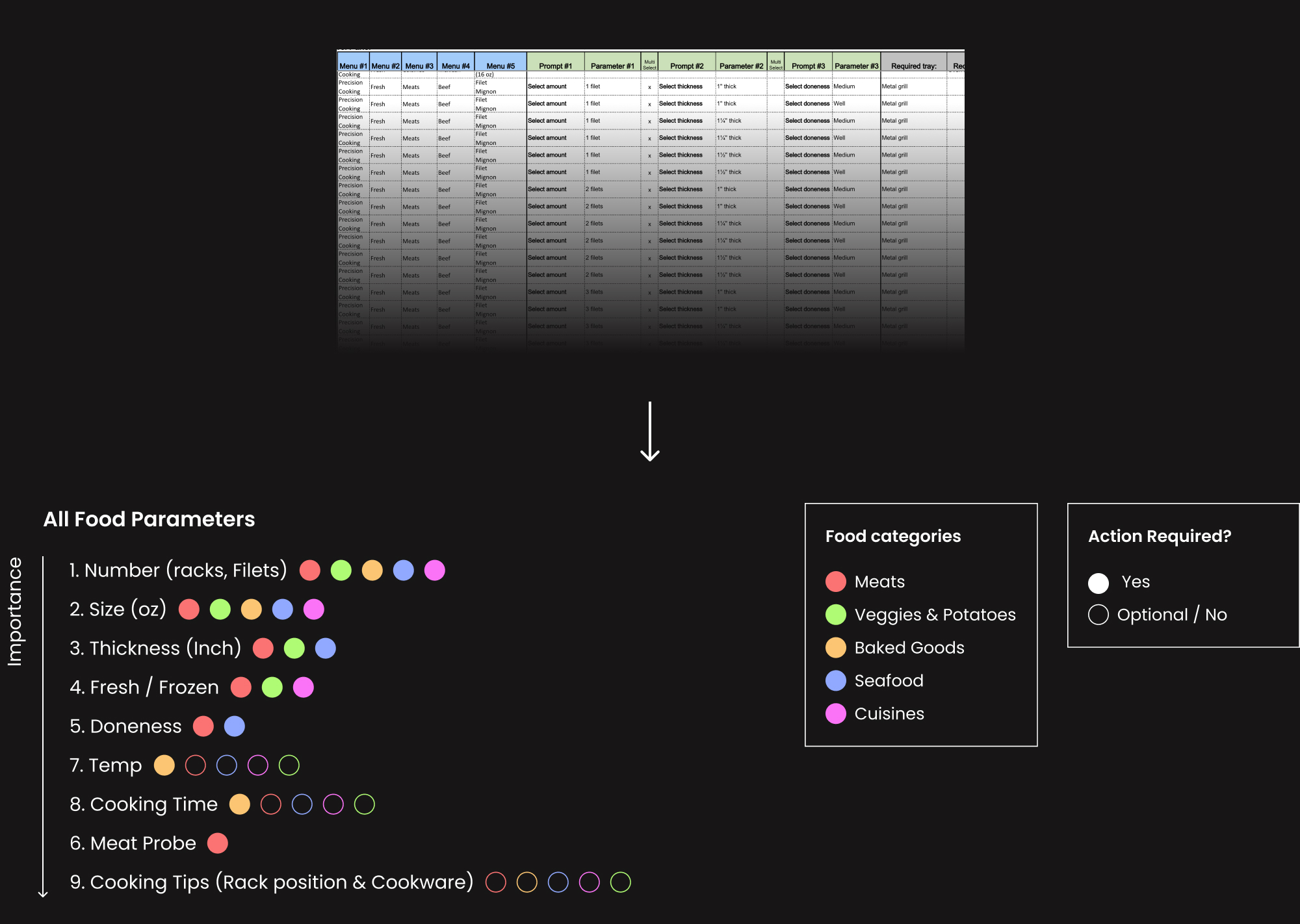
To come up with a streamlined progress indication solution, I revisited all the possible parameters in each food category.
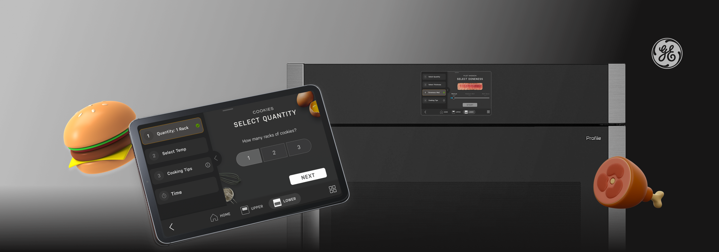
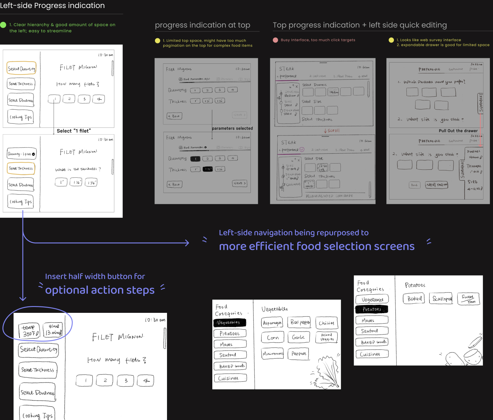
Then I sketched out a few possible solutions, and our team collectively pick the “left-side” navigation layout that has more space, and potentials to be repurposed.
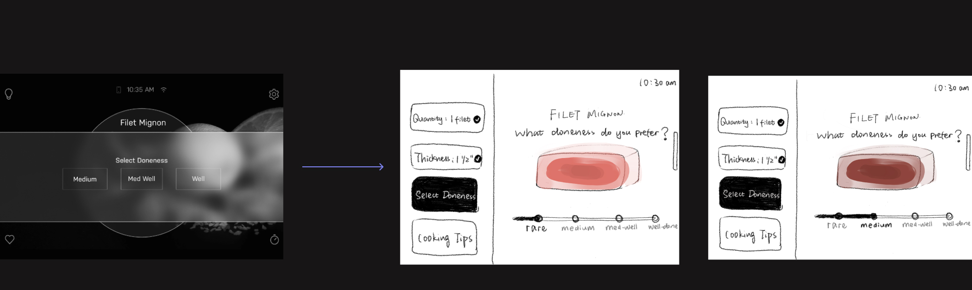
Since the majority of our users are beginners, and we want to attract them to try this feature. I changed the copy to a friendly tone of voice, with more visual guidance.
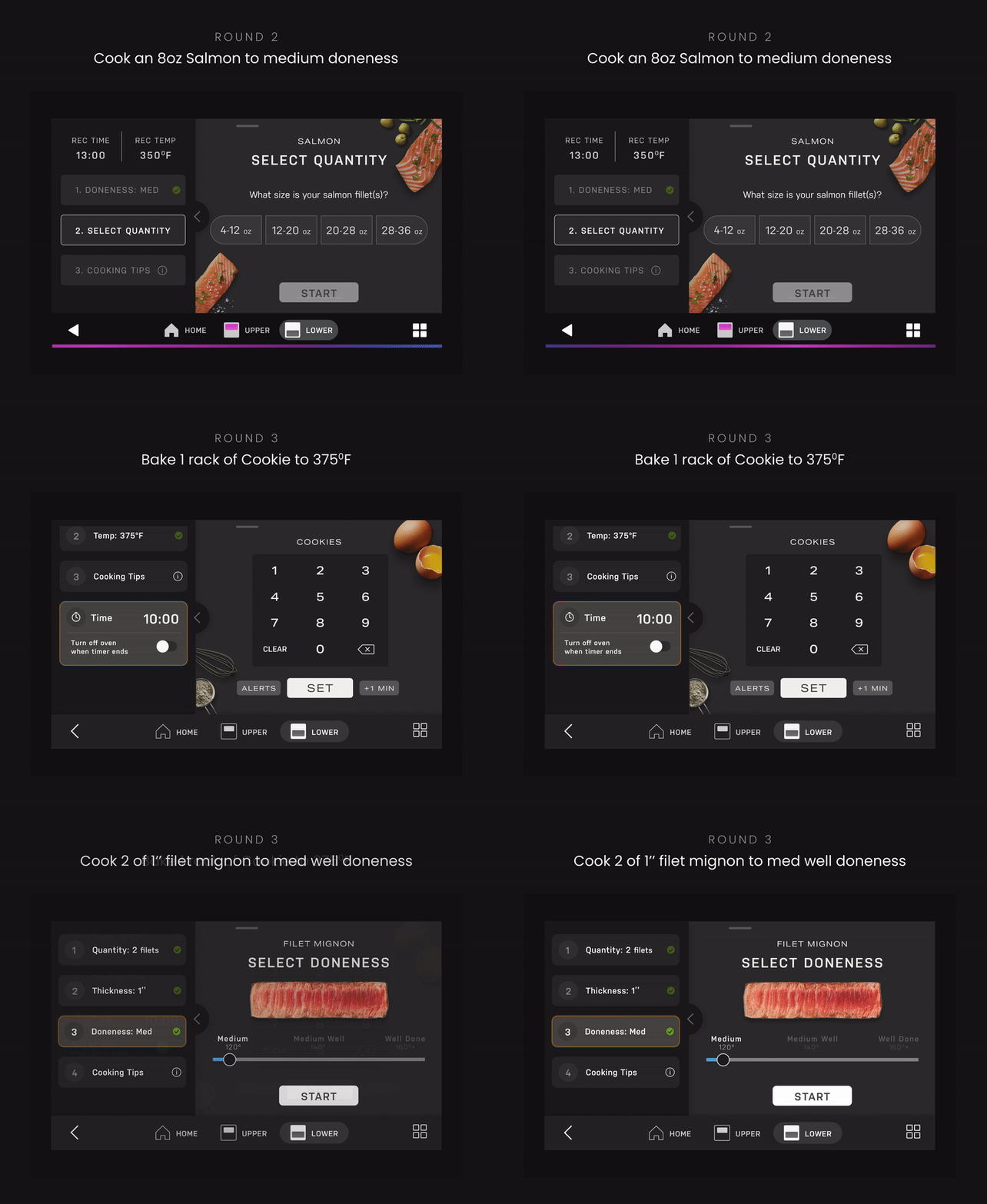
We conducted 3 rounds of testings. Each round we assign 10 participants cooking tasks and observe how they go about them.
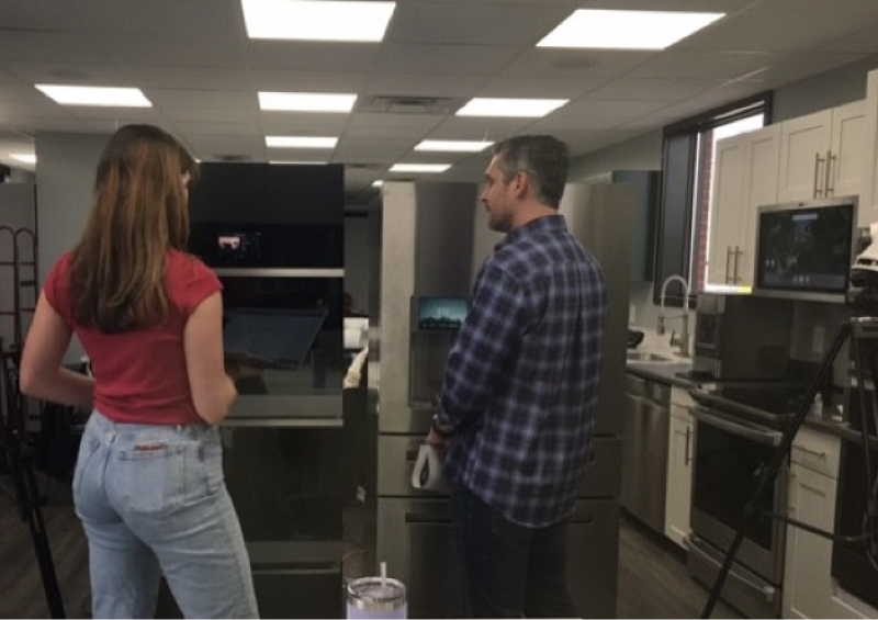
Task: Bake a beef tenderloin to medium-rare.
Figma prototype Link
The biggest usability problem
60% of the users don’t know how to use the left-side navigation without the “next” button for the food parameter inputs. The sequence indication is not clear.
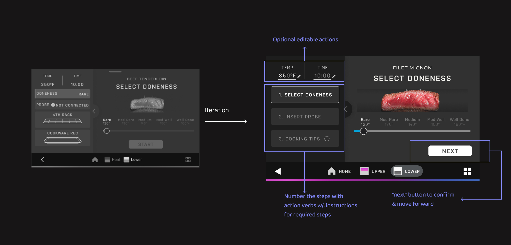
The Unexpected problem
50% of the users struggled to find "Precision Cooking" at start. While the other cooking modes are on the right, PC was placed on the left with a long intro paragraph. It looks advertisement to users.
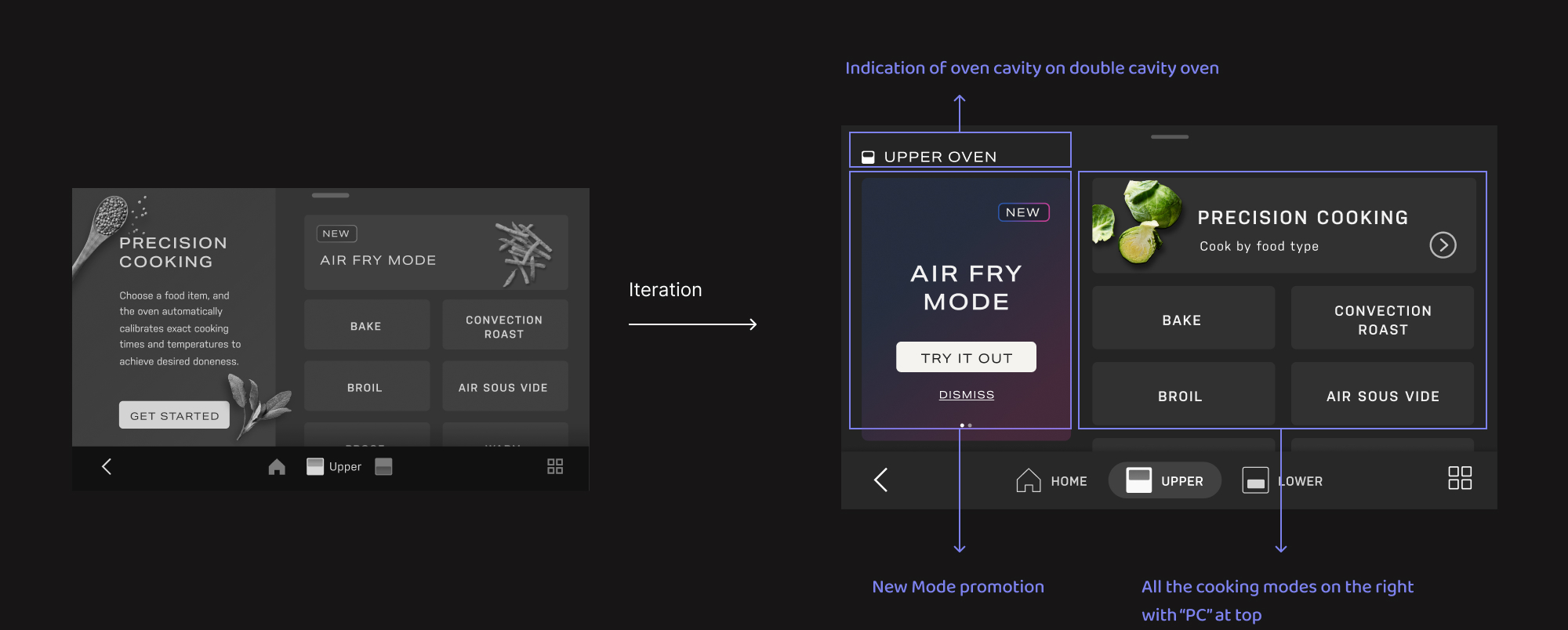
We implemented the design changes, and tested more cooking tasks in different food ingredients. Through these rounds, we established a solid design pattern that suits 125 food items.

Time spent navigating this feature decreased by 70%, with an average of 2 mins 23 secs.

100% of the users completed the cooking tasks correctly, and feel confident when pressing “start”.
The process of choosing food items is condensed to a single screen.
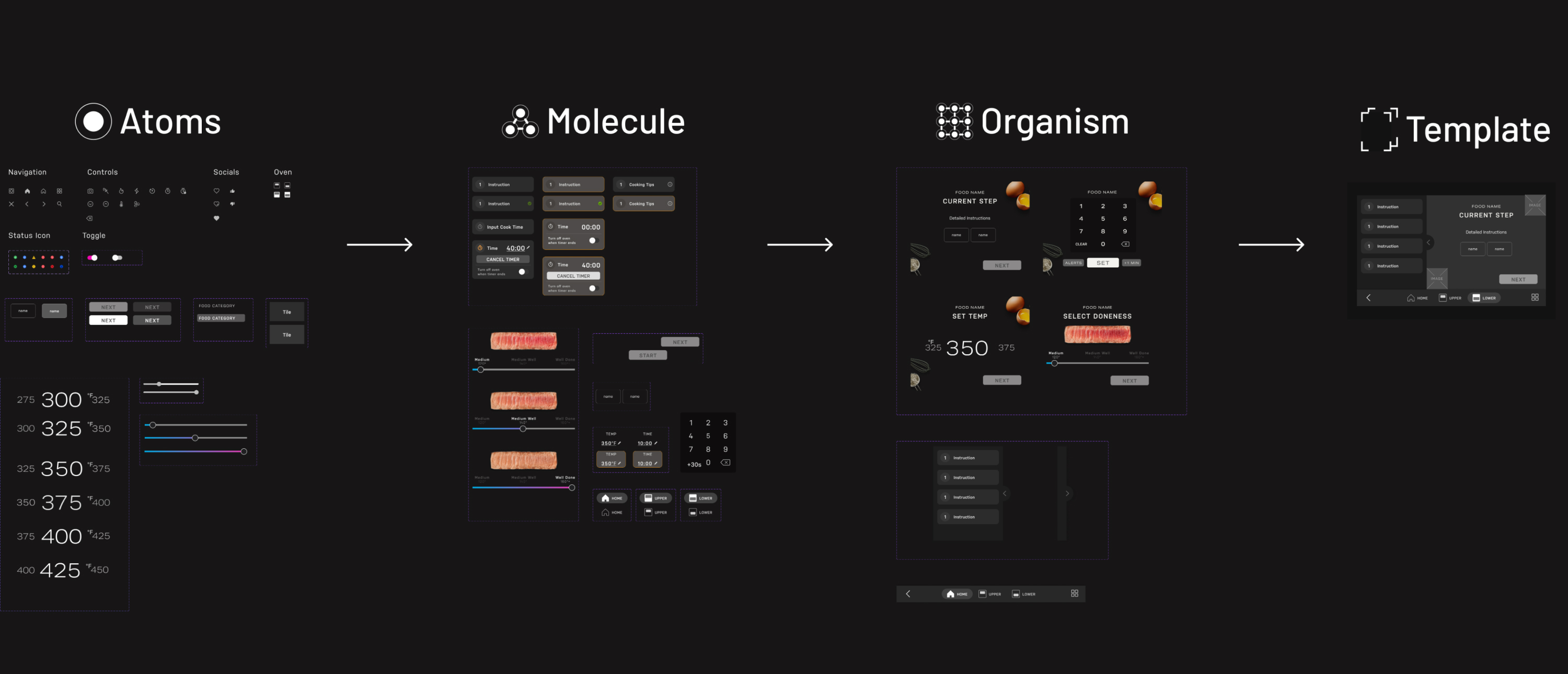
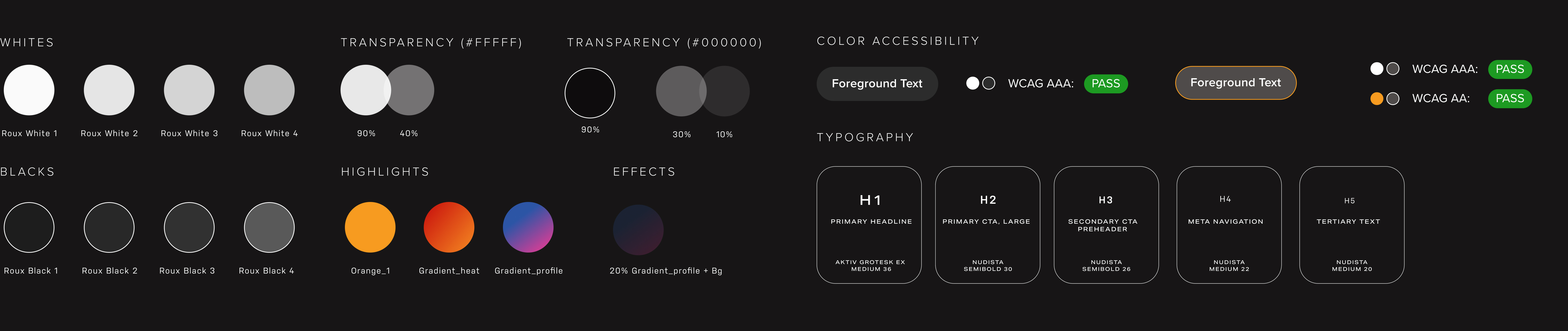
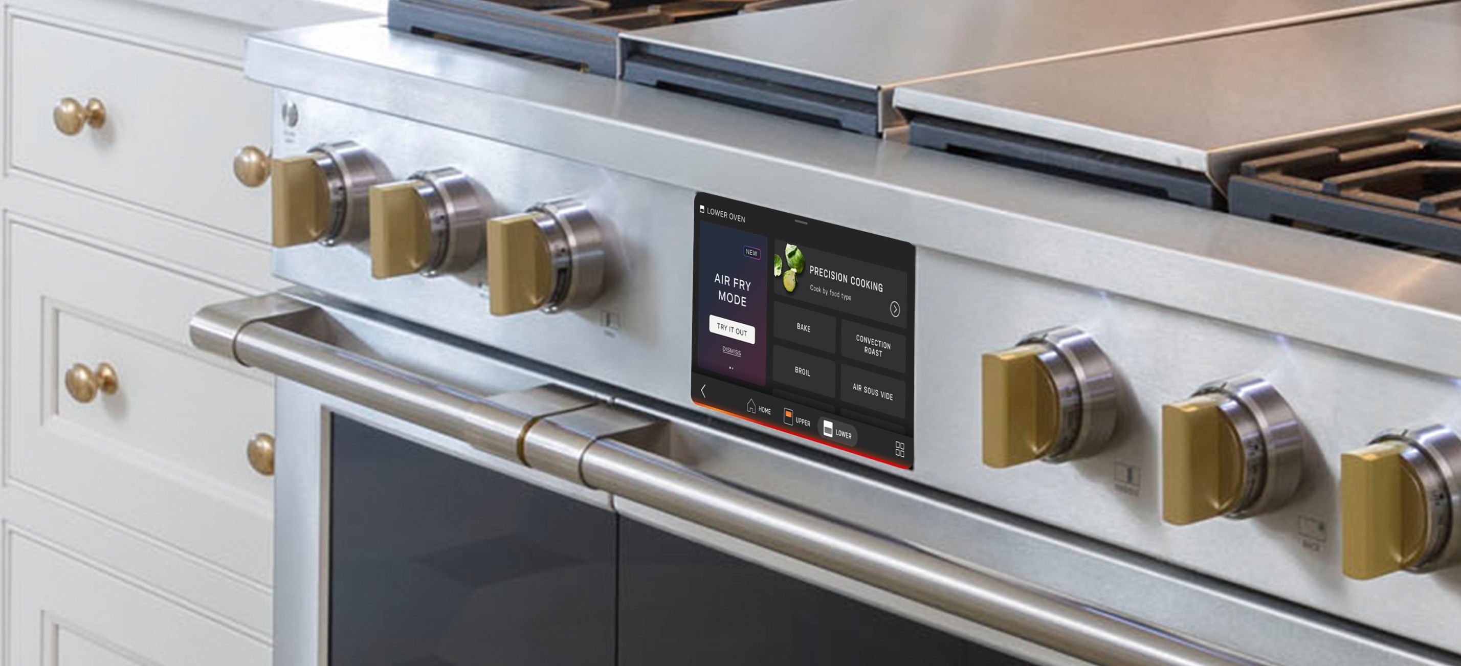
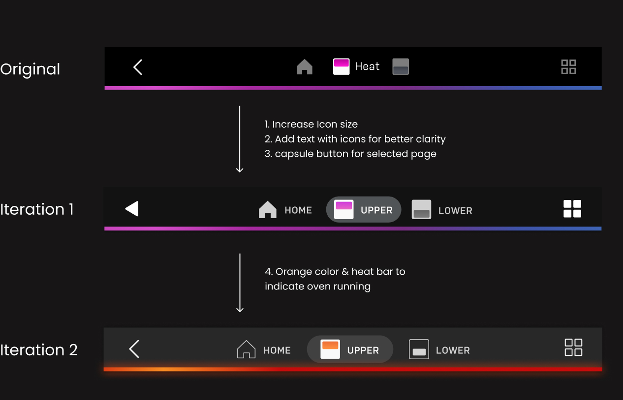
“Precision Cooking” is interconnected to other oven features in the LCD system. I also worked on other design improvements such as nav bar, icons, timer setting, and color accessibility with other designers. There are other areas that we want to revisit, but didn’t focus on this time.
People might look at the oven screen from a far distance. The primary actions need to be very distinct, with large text and simple hierarchy. Testing minimum readable text size is crucial.