It allows our customers to control GE appliances remotely from their phones.

Without any formalized design system...
SmartHQ app 1.0 version lost design consistency as it kept expanding for over 1000 appliances models across 11 product lines.
1. Defined a new control page structure that fits all the product lines for the 2.0 new release.
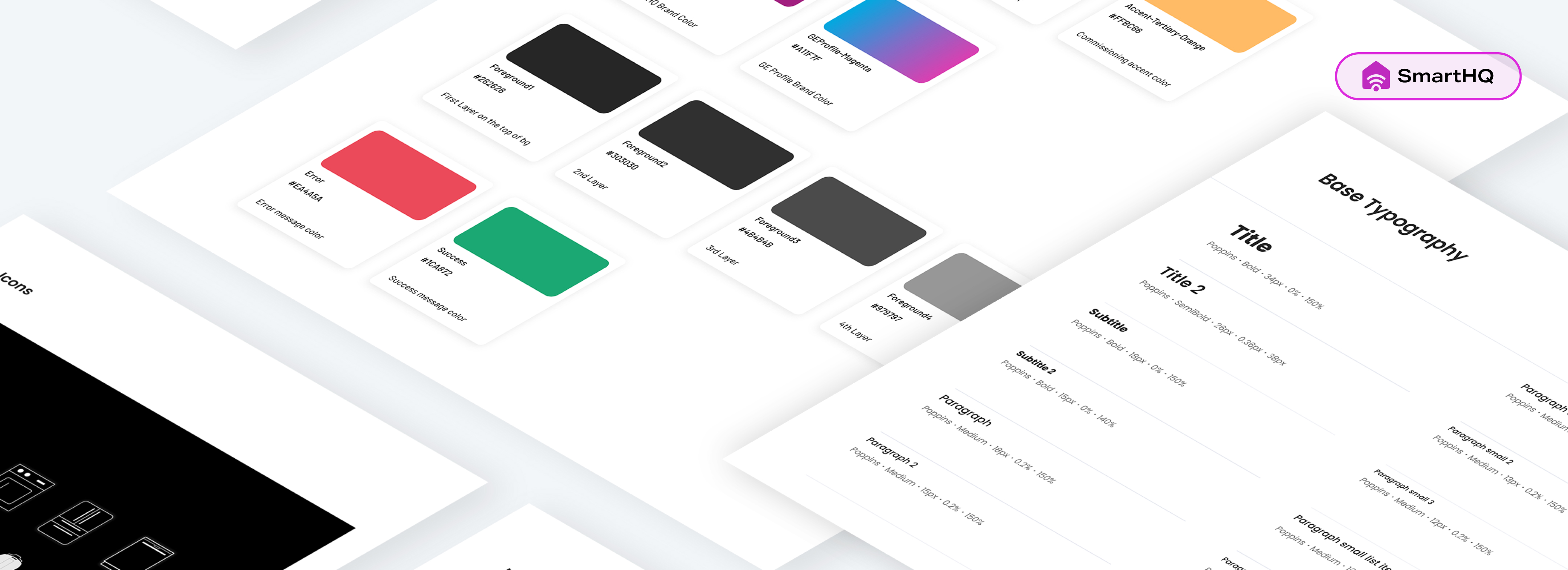
2. Built the first smartHQ design system with color, grid & spacing and UI components, comply to WCAG Level AAA.
How does inconsistent interfaces affect the our customer’s experience?
In 85% of the cases, users choose to download smartHQ when they own more than 1 smart GE appliances. But the control pages of different products differ a lot, which increases the learning curve.
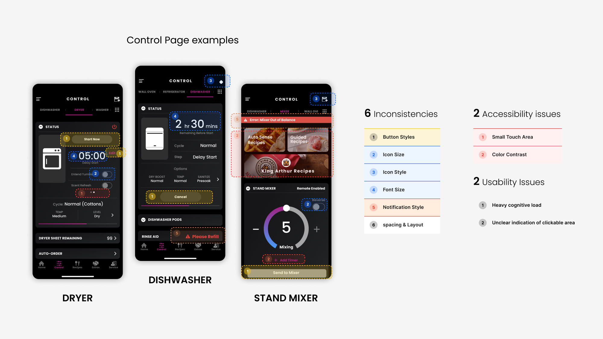
How does inconsistent interfaces affect the our customer’s experience?
1. Large communication gap between design and dev
There’s a lot of misalignments between shipped designs and final products, such as padding, spacing, and font size. We need a better system to streamline the process.
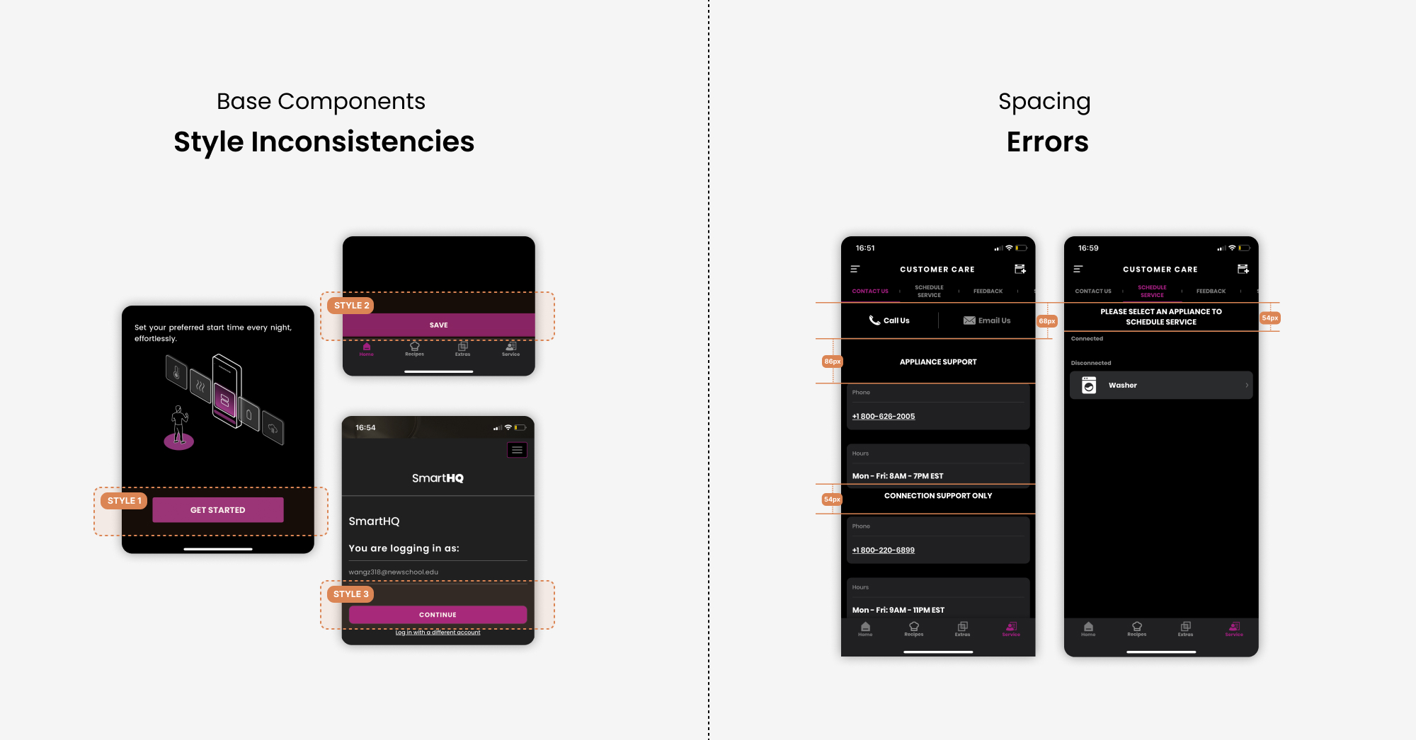
2. Inefficient Design workflow
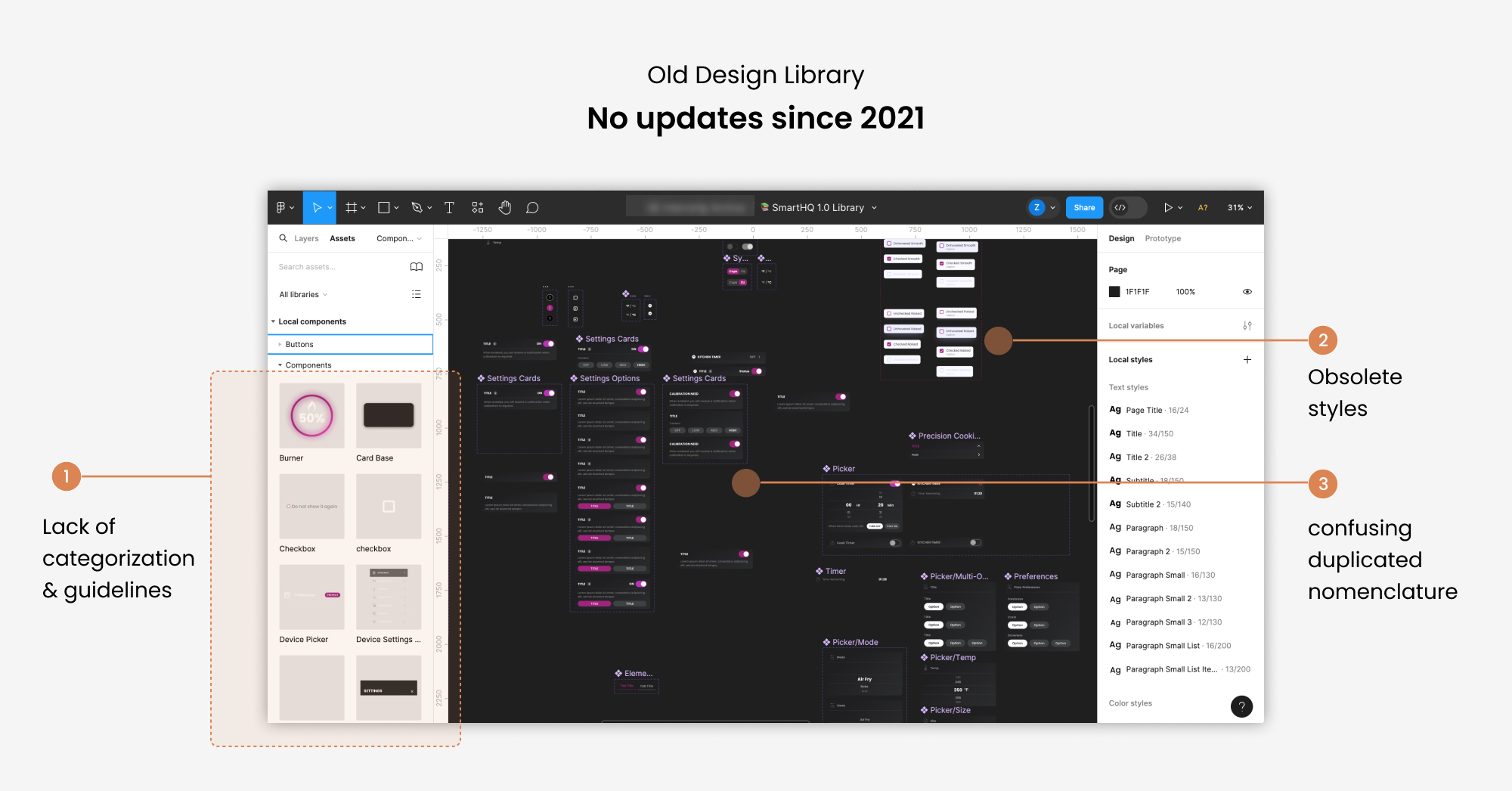
The design team has a Figma file that hosts old smartHQ components. It’s disorganized, and haven’t updated since 2021. Sometimes our designers need to go to other design files and get components from there.
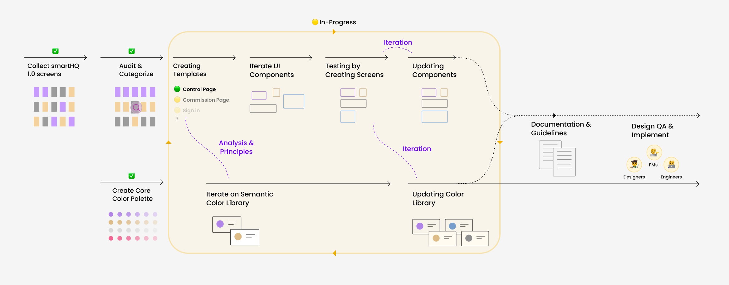
We start with collecting and auditing the existing screens in smartHQ. We collected 1000+ screens, removing the duplicates, and end up with 5 big categories.
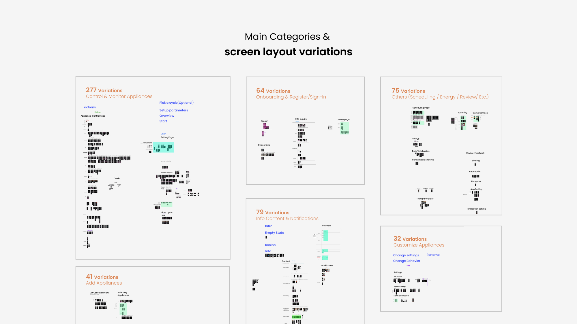
Among all the categories, “control and monitor appliances” is the biggest and most complex category.
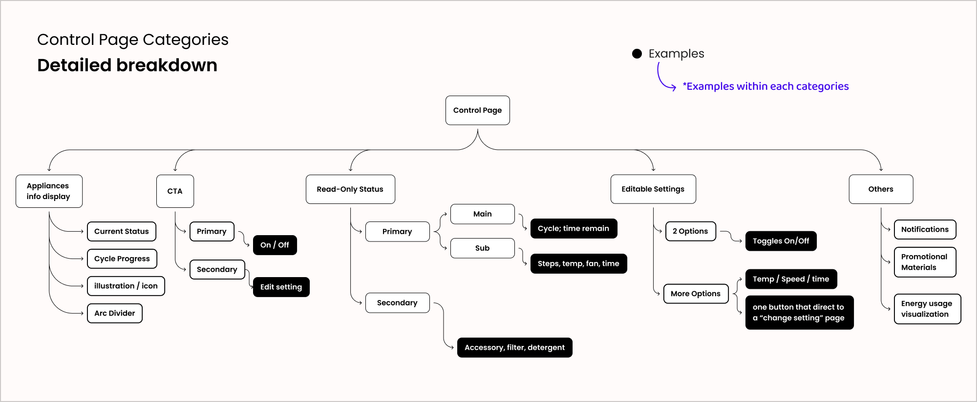
Therefore, we started from the control page where the users view their appliances’ current running status, and open the setting menu to edit them. After finishing a deep analysis for all the control screens, we identified the 4 types of information.
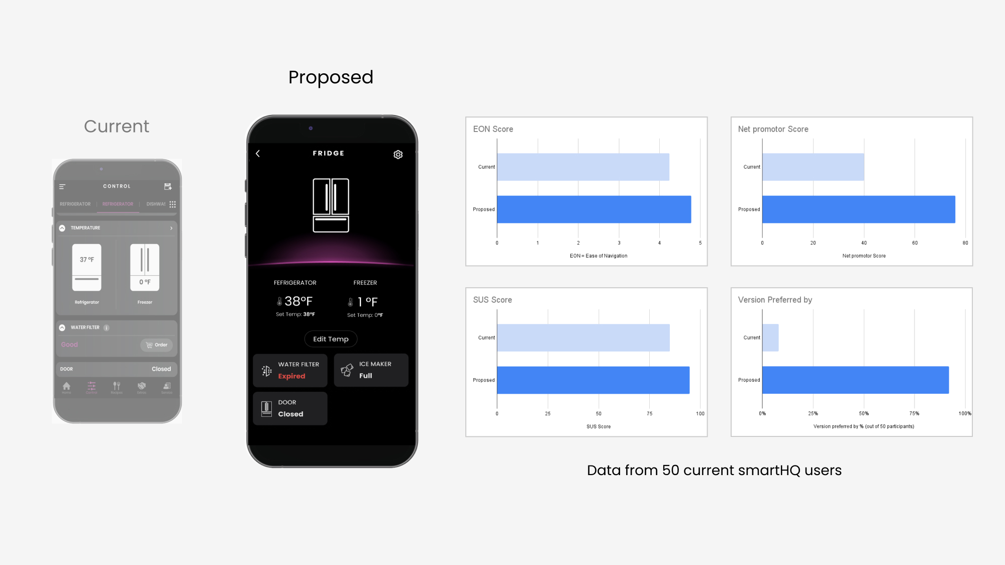
In earlier 2022, our UX designers proposed an alternative control page layout. They tested it with user flows for several appliances, and got positive feedbacks from participants. Their proposal provides a good reference for our systematic redesign.
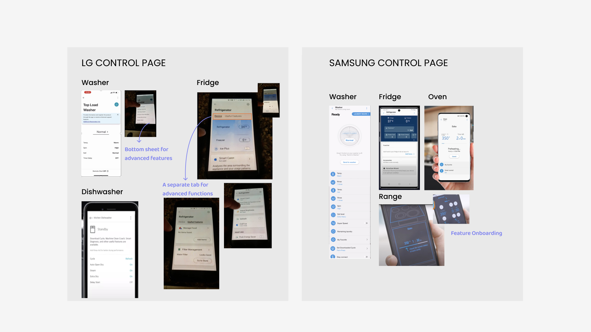
What did our competitor do better in their appliances control page?
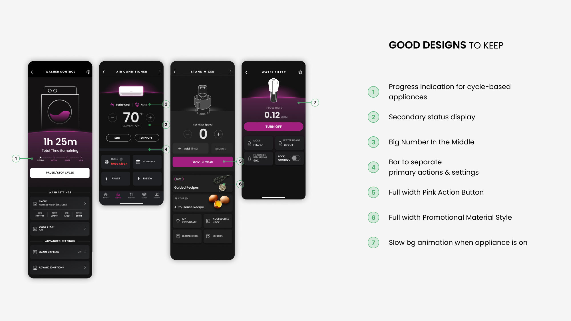
Here are some good takeaways.
They established a design pattern with appliance status displayed at the top, with editable settings at the bottom half of the screen for easy thumb reach.
They did better in visual hierarchy, and page spacing by having enough white space.
Their control pages for different product lines also lack consistency, which could be improved too.
We did several brainstorming sessions to sketch out some rough ideas for a new control page structure that could apply to all the appliances.
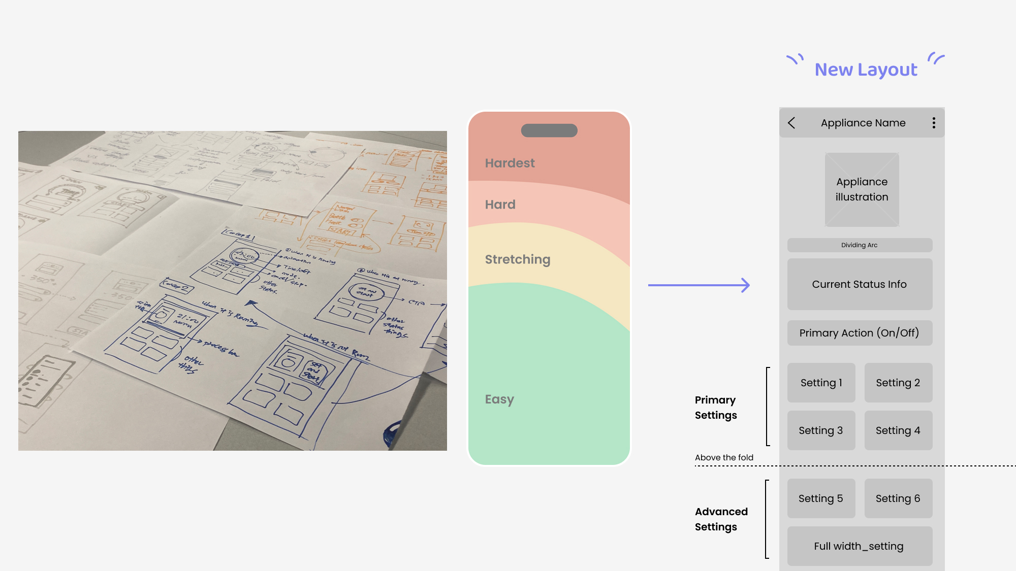
We followed the low-fi layout and created some hi-fi concepts for different appliances, and presented to the design team. We decided the final layout based on feedbacks.
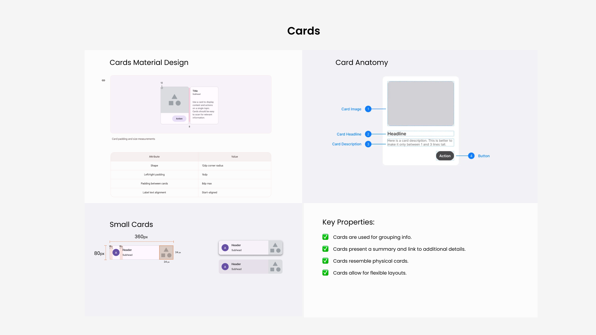
Before start, I researched some common practices for the base components. I focused my research on the ones that closely related to control page, which are tiles, cards, buttons, and bottom sheets.
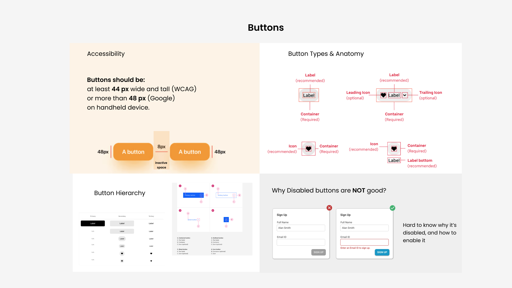
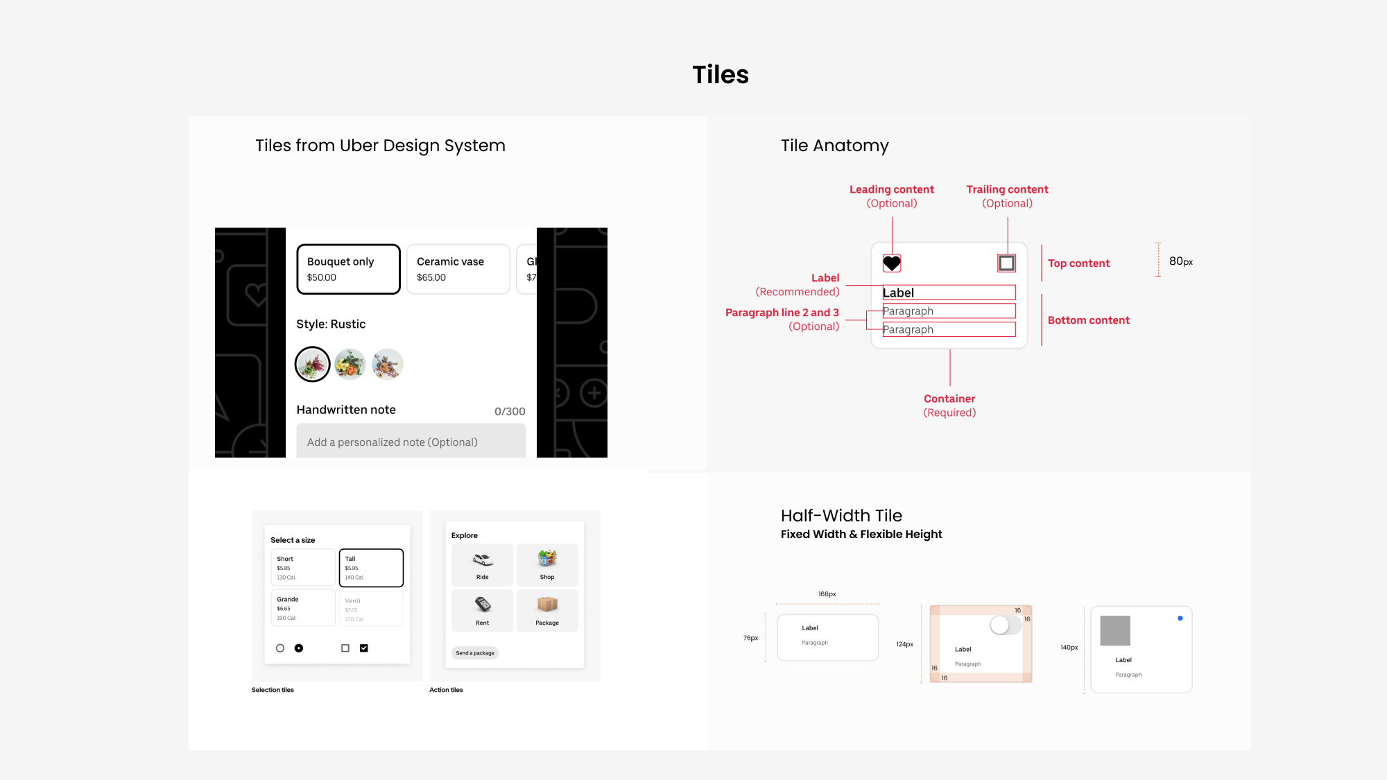
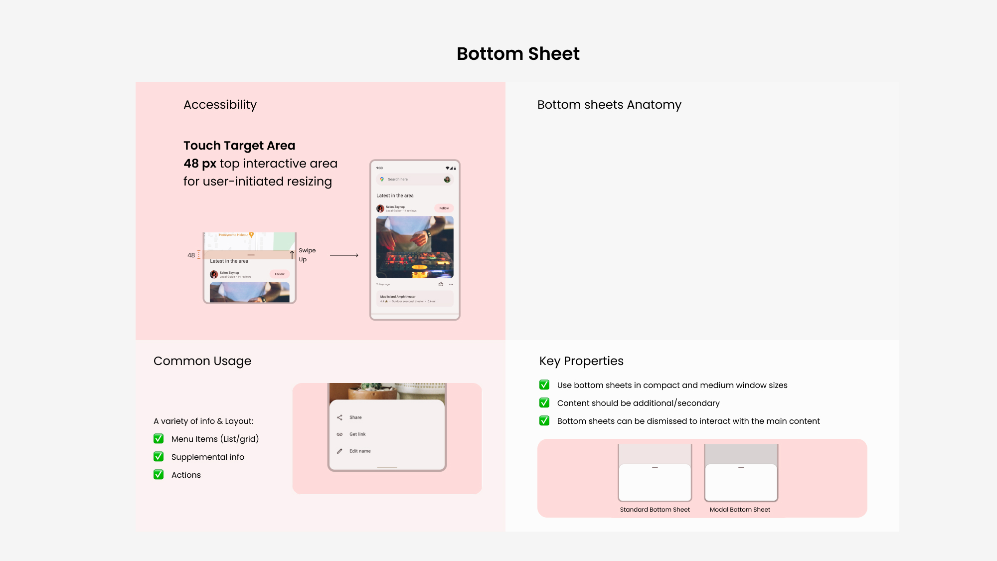
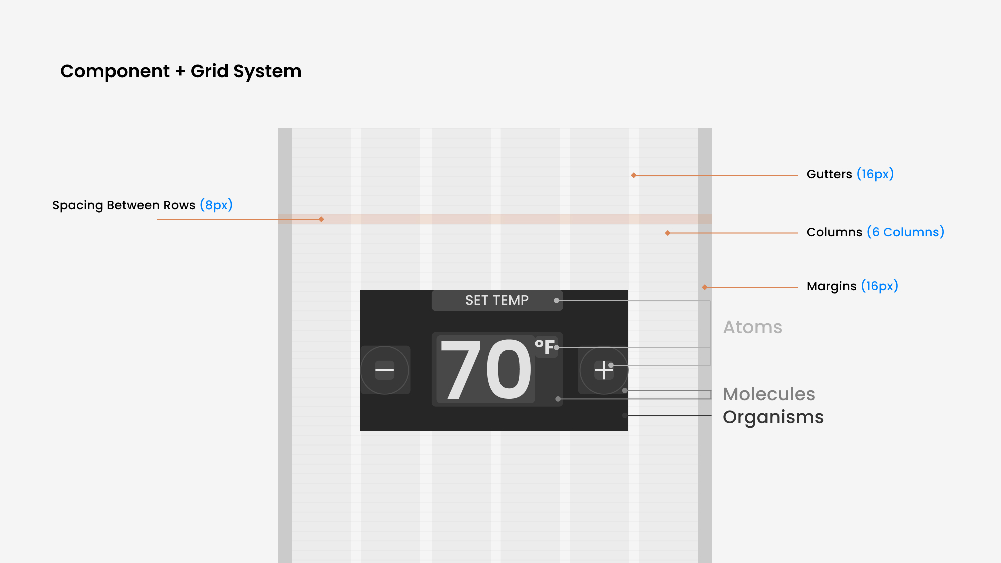
While I was working on the control page components, my co-workers worked on color, typography, and grid system. We incorporated each others’ design decisions into our own parts, then built the foundation for the design system.
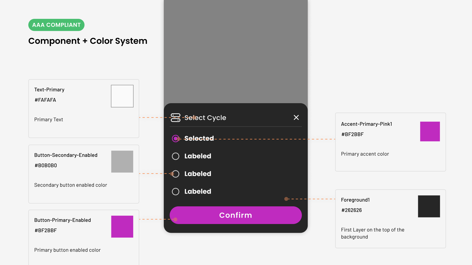
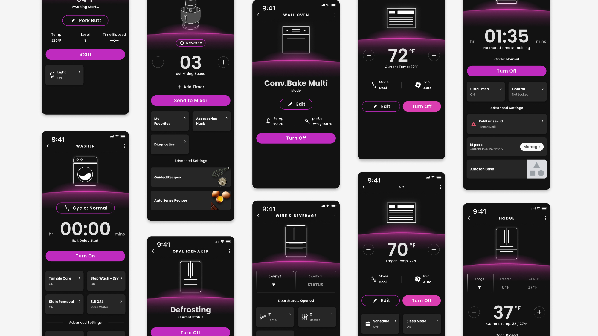
I hosted 2 internal testing sessions, explained how to use the components, and asked other UX designers to build the control page using the new components. These are the final designs coming out of the workshops.
While building components for the control page, I also looked at the existing formats in our app to edit appliances current status.
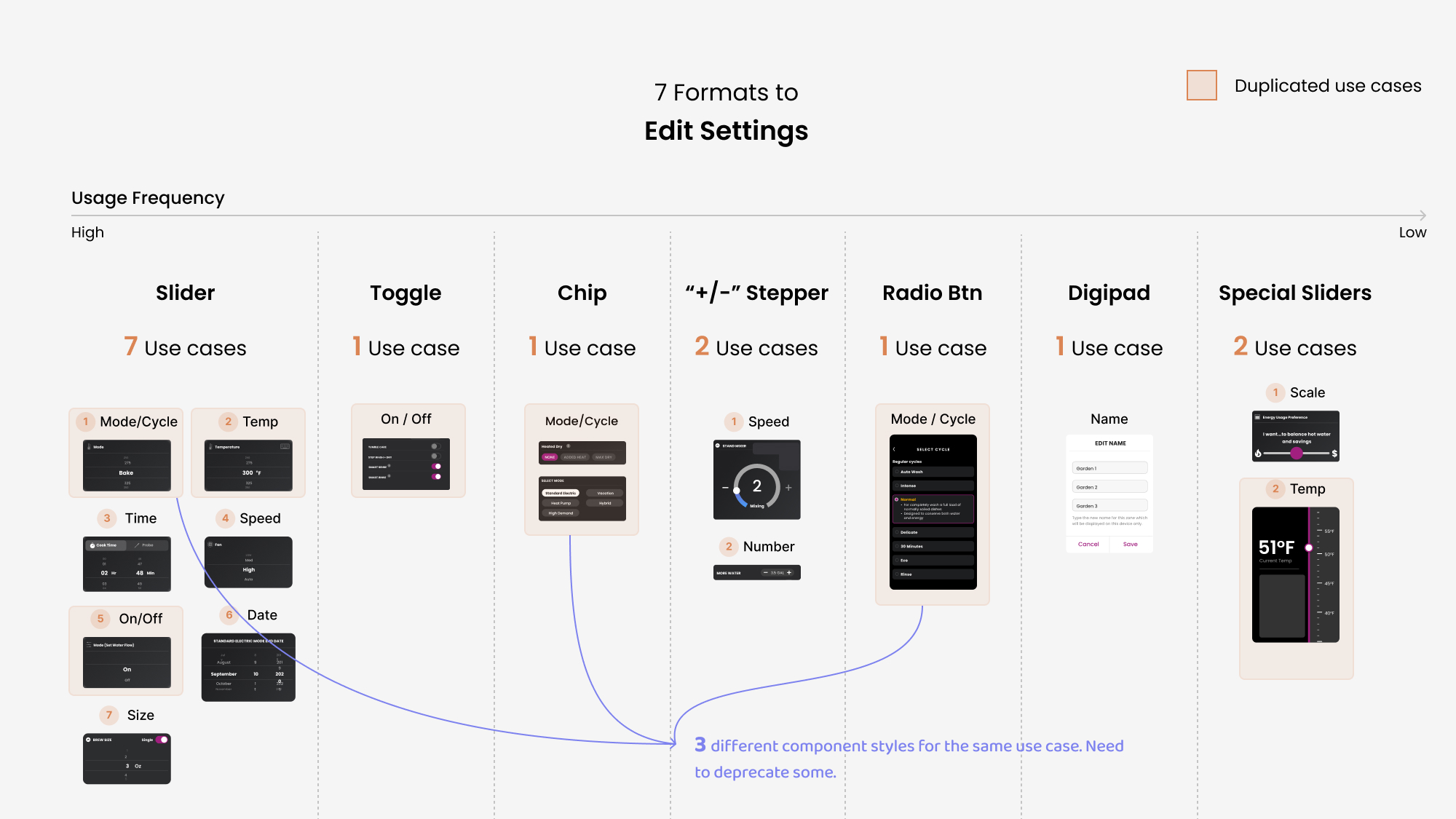
I found different formats were used for the same use cases. After discussing with other designers, we decided to remove some duplicates, and deprecate the “slider” styles for better accessibility.
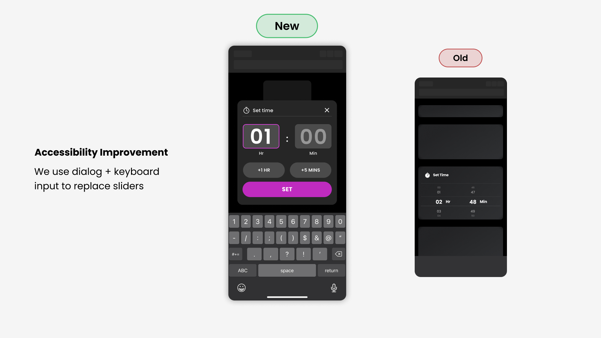
"Swiping" action doesn't work well with screen readers.
Slider is highly inefficient for visually impaired users that needs to hear the screen reader to read it out every time a new swiping action is made.
After finishing the base components, I built a control page template with defined spacing. Other UX designers can use it to build / update new control pages with a few clicks.
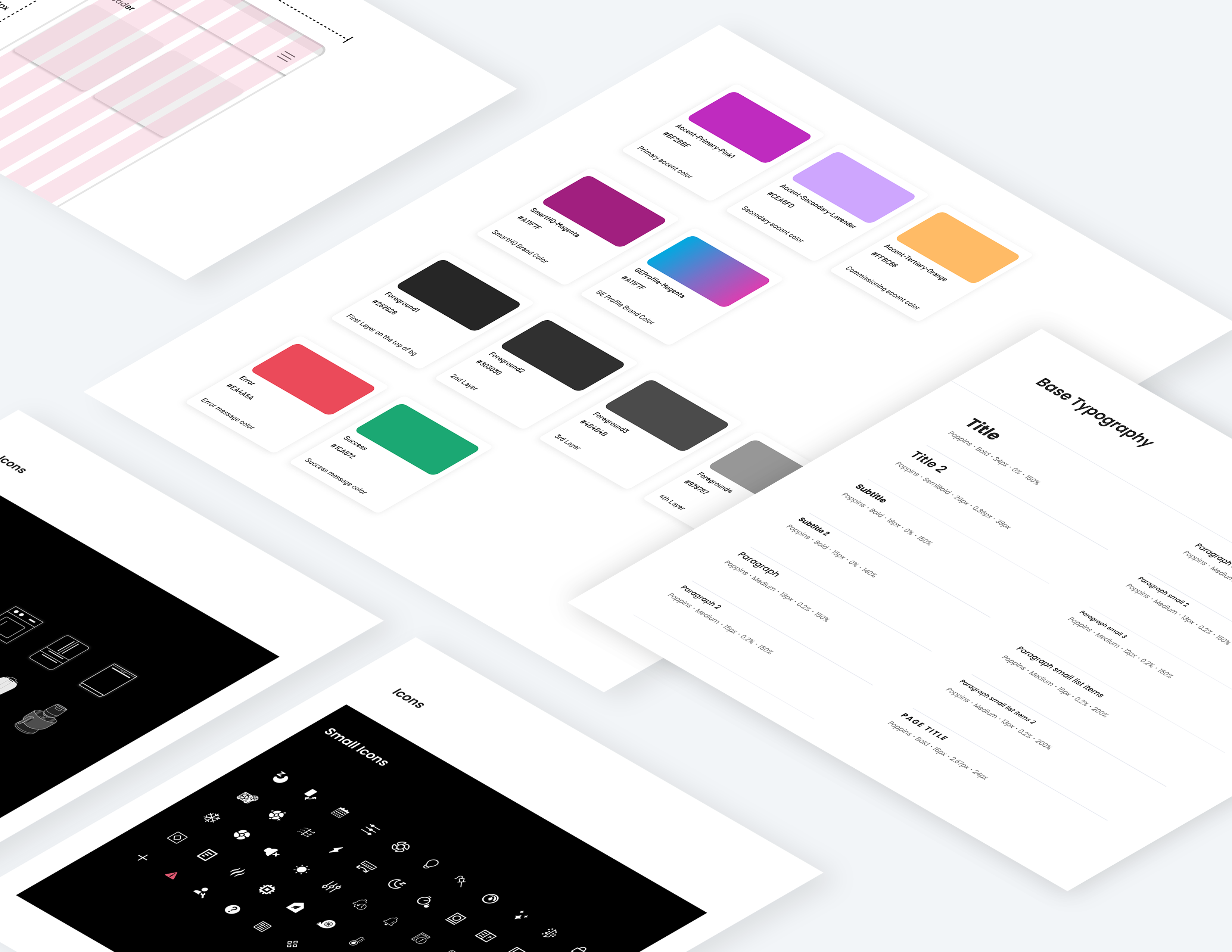
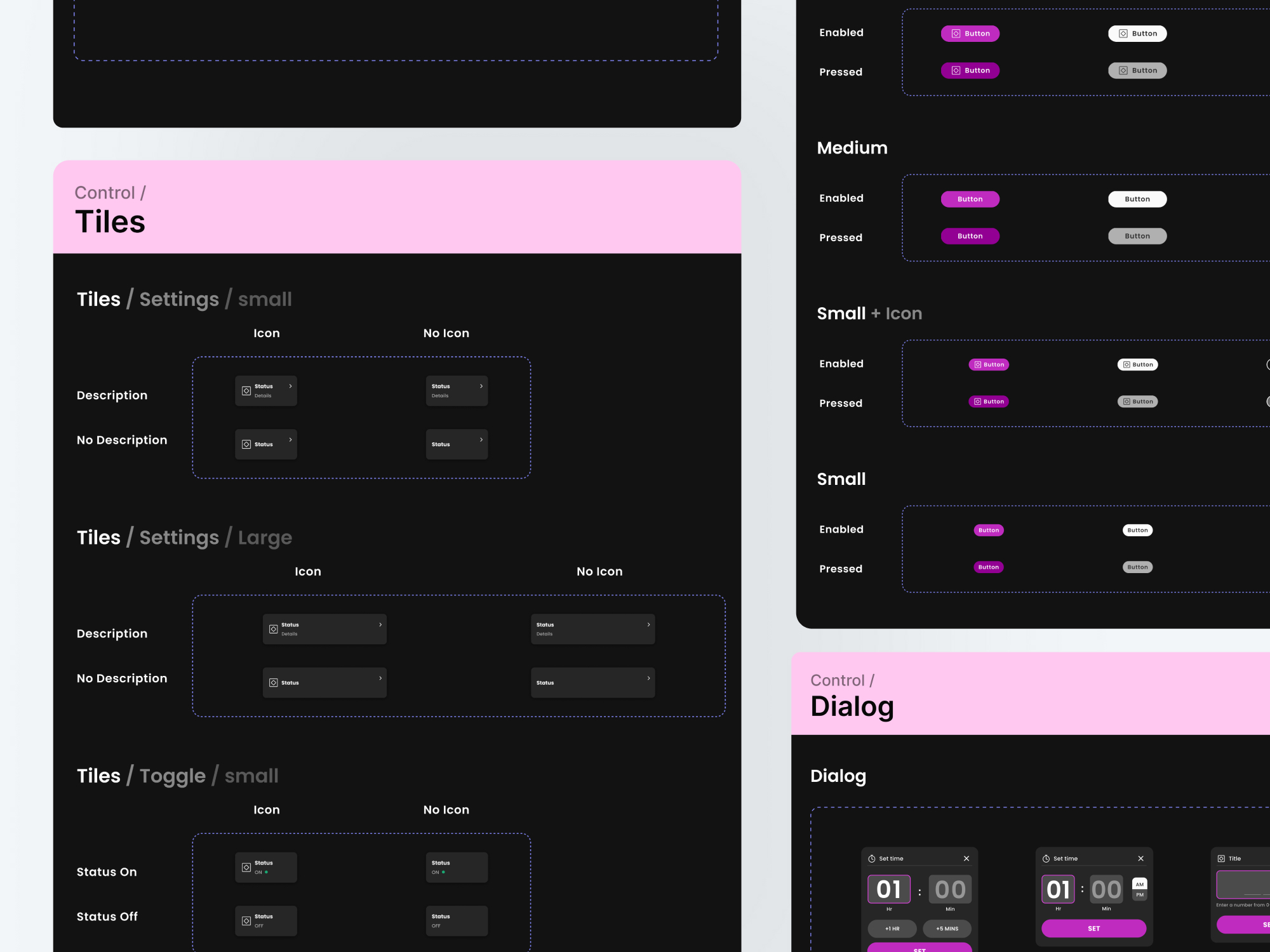
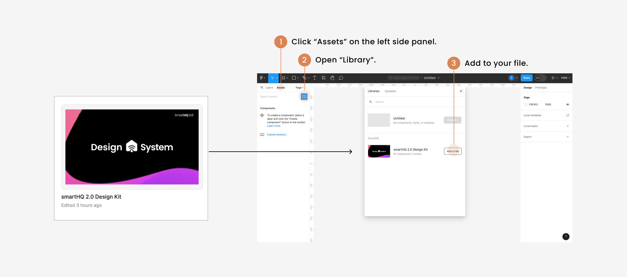
We published the new design library in Figma, and includes a brief guide for enabling this library in other design files.
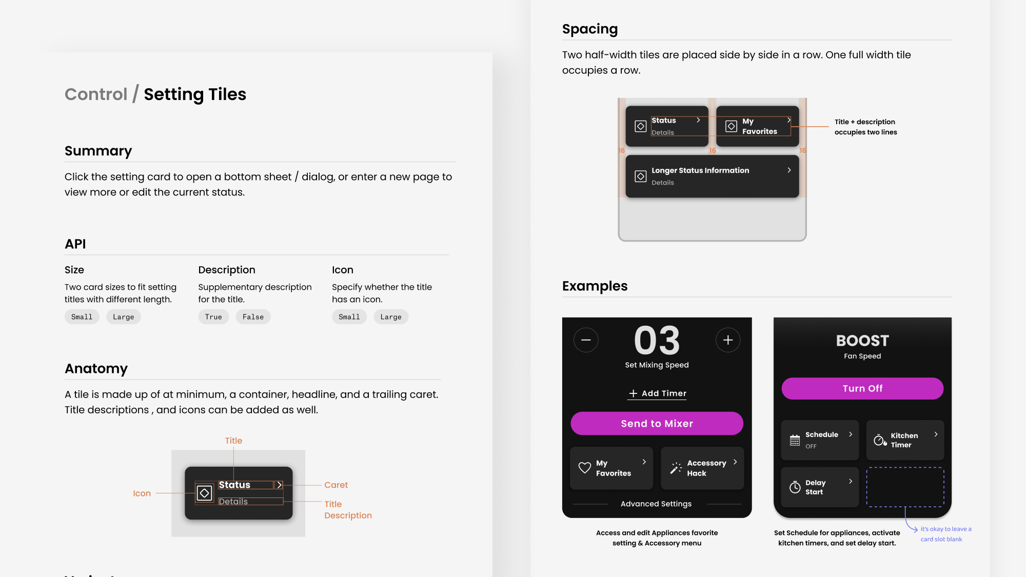
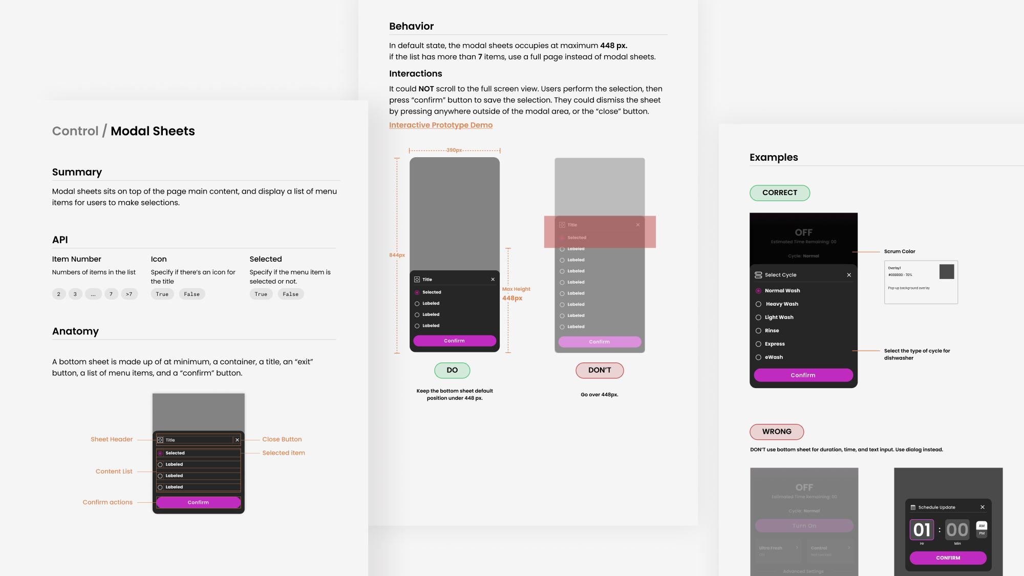
I also worked on documentation and guidelines for the new components. Designers and developers can refer to it for more specific guidance. Here are some examples.
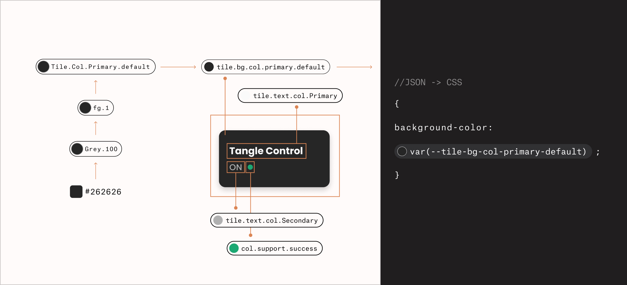
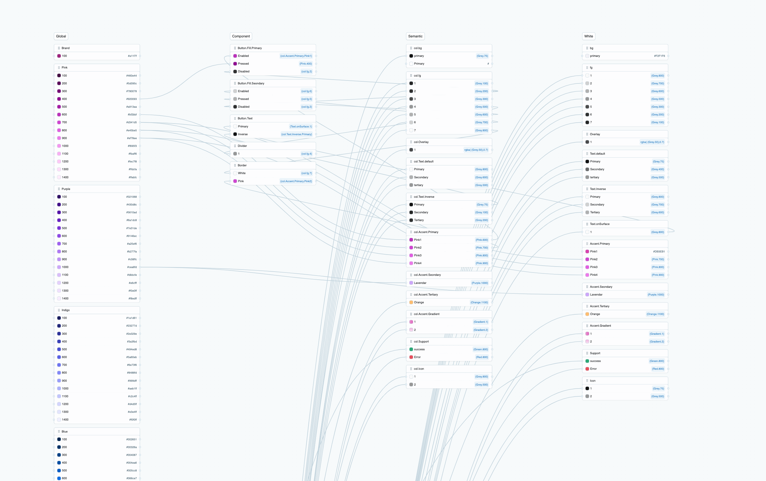
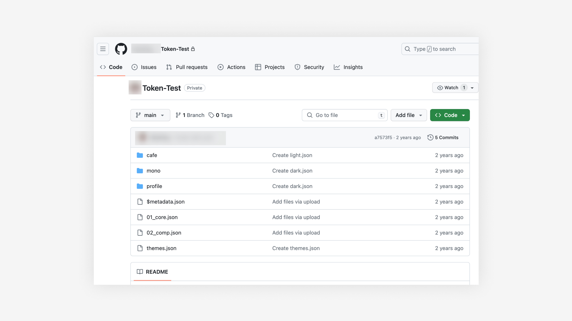
Afterwards, I worked on the nomenclature for color tokens, and experimented with "Figma Token Studio" plug-in with another designer. We involved dev team into the discussion, and did some preliminary works as the starting point.
We need to expand our UI kit to fit other pages. Through the project, we’ve already established a workflow for building components.
In addition, We discovered a few misalignments between shipped designs and final products. We need more than a design system, but a better QA workflow to spot the discrepancies in the early stage.
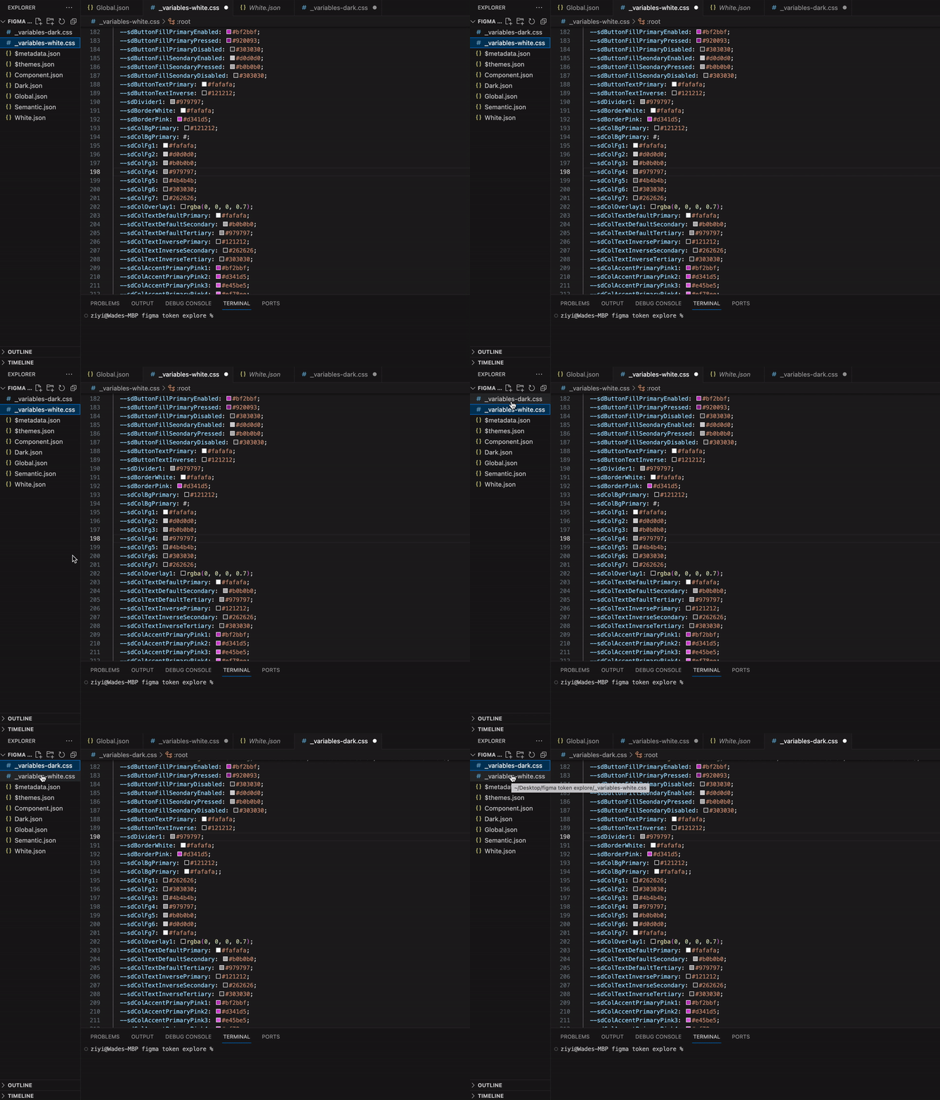
We need to continue the discussion with dev team for implementing the design tokens, and help them bridge gaps between Figma Token and CSS styles.
I made several micro-decisions with my manager during the component building process.
For example, we got rid of the toggle for a minimalistic clean look on the small tiles. When tapping the card, it would switch the current setting on/off. This is a new interaction that needs to be further validated through testings.

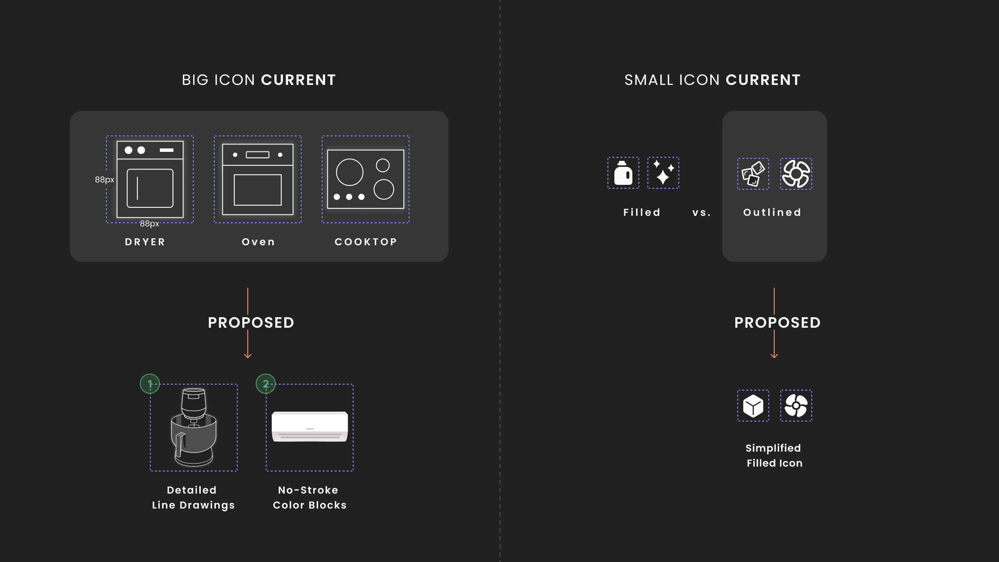
I spotted a lot of inconsistencies in icon styles while collecting the existing icons for our design kit.
For large appliances icons, we could try to increase visual details to better distinguish between different appliances. And for small icons, we could simplify them for better visual accessibility on small screens.
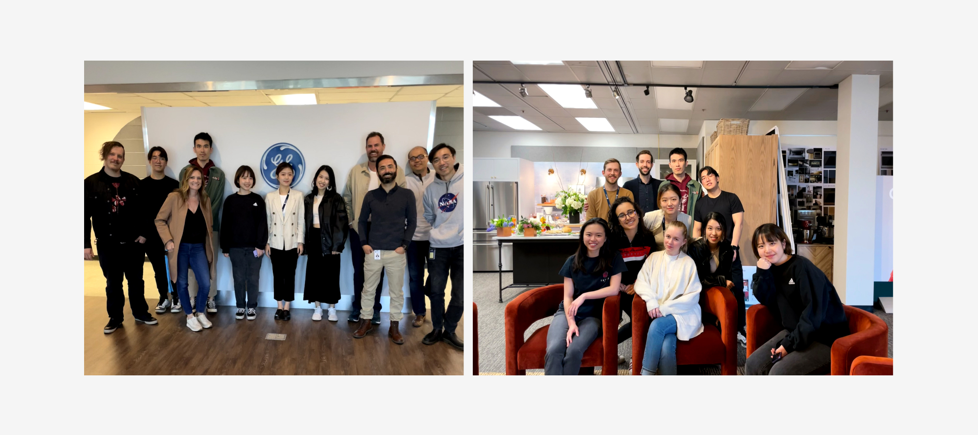
This massive and challenging project wouldn't be possible to progress that much without my amazing UX teammates, and the support from dev team for learning a new tool together. Teamwork makes the dream work!